
What Happened Next Tuesday: A New Way To Understand Election Results
By Yair Ghitza (@yghitza)
When the polls close on the midterm elections this coming Tuesday night, the country will turn its temporary attention towards understanding what happened. The winning and losing candidates will likely be clear. However, the “how” a candidate won, or the “why” a candidate lost will not be. Analysts and pundits will pore over exit polls, election results from bellwether counties, and more. They’ll tell you what demographic groups turned out, who they voted for, and why. Most Americans, generally unaware of how polling and election analysis are actually done, will listen to the coverage and take it as ground truth. By week’s end, the election narrative will largely be set, and everyone will move on, fully confident they know the fundamentals of what did and did not happen.
But are things really that simple?
Let’s take an example. What do we know about 2016 voting among white (non-Hispanic) voters without a college degree? Without a doubt, this voting bloc was critical to President Trump’s victory in 2016. Countless hours have been devoted to understanding why many switched from supporting President Obama to Trump, and where they might go from here. So you might think, a full two years after the election, we’d know the answer to a few simple questions: how big were they, as a percent of 2016 voters, and what was Trump’s margin of victory among those voters? Let’s see what the data says.
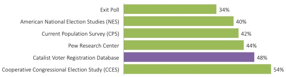
Percent of 2016 voters that were White Non-College, according to various data sources
Estimates from the most widely used datasets vary to an astonishing degree. According to the exit poll — overwhelmingly the most used source for news stories and therefore the American public (largely because it is available first) — white non-college voters were only about a third of the electorate. On the other end is the well-respected CCES, saying they were actually half of the electorate[1]. The bars in green show the most widely used public data sources. I’ll return to the Catalist dataset shortly.

Trump’s margin of victory among White Non-College voters, according to the same sources
What about candidate choice? The Current Population Survey doesn’t report this data, but the others follow a similar pattern: the data sources showing white non-college as a smaller share of the electorate, also show Trump having a larger margin of victory[2]. By one view of the 2016 data, white non-college voters were only a third of the electorate (and are shrinking), and they voted for Trump by close to 40 points. By another, they were actually half the electorate (and much more in many places) and supported Trump by 25-30 points.
So what’s the right answer?
We’ll discuss this specific example more below, and there is strong evidence that non-college white people were closer to half the electorate than a third. There are, however, no definitive answers to these questions. They all involve statistical estimates, because of the secret ballot and the way we collect information about voters. Each data source is based on a different set of assumptions and choices, each has strengths and weaknesses. Sorting through these issues is a long and highly technical conversation. If you want a small taste, take a look at a few of these articles.
Now many researchers in public and private settings are making progress on these difficult issues. I work at Catalist, a company that compiles and analyzes voter files across election cycles. Voter files are databases of registered voters, maintained by each Secretary of State across the country. My company, and others like it, collect that data, standardize it, and make it available to political campaigns, civic organizations, and other research institutions. Importantly, Catalist maintains a unique longitudinal data set across cycles. While voter files have been widely used by campaigns for quite a long time, they’re starting to be used in public places more and more.
We’ve recently developed estimates for an “exit-poll-style” demographic analysis of past elections since 2008, and we’re planning on releasing estimates for this midterm cycle shortly after the 2018 election. Data will be available for select states and congressional districts, possibly including a national estimate (see below for more detail).
Like the other datasets listed above, the voter file isn’t perfect. But we think it is an ideal starting point for understanding what happened in past elections. The main advantage of the voter file is that we start with a rich and detailed view of the composition of the electorate:
- The voter file tells us exactly who voted. We don’t rely on self-reported survey data on turnout, which is notoriously inaccurate. We don’t rely on precinct sampling, and we don’t have to recruit survey respondents, which may or may not be representative of the true voting population. We start with the full list of everybody who voted, as was officially recorded by each Secretary of State.
- Some demographics like age and gender have close to full coverage for voters, because these are almost universally used in voter registration forms. For these two, we’re confident that voter file estimates are the most accurate available[3]. For other demographics like race and education, self-reported data isn’t available in all geographies across the country. The voter file does have a lot of other information which is helpful for estimating these demographics. Our process starts with large-scale machine learning models to identify the probability that each voter has a certain racial background, for example, based on whether (s)he has a particularly ethnic name, neighborhood, and other characteristics. Because we have precise geocodes for the vast majority of voters in our database, we can compare and calibrate these estimates to census and other outside data sources to remove inaccuracies that are introduced using standard modeling methods. Critically, we build the models in such a way that even if we can’t precisely identify all demographics at the individual level, our estimates are accurate at the aggregate population level. We can’t claim that our estimates are 100% accurate, but we do feel that the effort spent here makes these into very high quality, defensible estimates when compared to anything else that we’ve seen.
- Lastly, we’ve been collecting voter files in a consistent format since at least 2008 in every state in the country. This gives us a relatively long history of data, from which to build our models and calibrate our methods.
This gives us a great foundation for understanding the composition of the electorate. To understand candidate choice, we combine the voter file data with survey data using a statistical technique called Multilevel Regression and Poststratification (MRP). MRP combines flexible statistical models with large population datasets to provide more reliable estimates for small subgroups where standard survey methods don’t have enough sample size to work properly. While MRP is a general method that has shown promising resultsand is becoming increasingly popular (with some skeptics), we think it is ideally suited to be used with voter files, due to the large amount of detailed data there. We developed some of the specifics about this in an academic context starting in 2013, and have since improved on those methods in various ways for this project.
How does our data compare to some of the more familiar public sources, particularly the dominant exit poll? Data at the national level is available here, focusing on demographics that are reported consistently across all of these datasets[4]. Some of the consistent trends are:
- Our data shows an electorate that is consistently less college educated (34% in 2016, compared to 50% for the exit poll), older (25% aged 65+, compared to 16%), whiter (74%, compared to 71%), and often has more women (53–55% across all years, sometimes it is lower for exits). These differences extend back to 2006, and they span both modeled data and data reported directly from the Secretary of State (age and gender).
- At the same time, our vote margins are often larger than the exits within each group. Some of the largest and most consistent differences are among white non-college voters (an average difference of 8 points in margin) and white women (6 points).
- Lining these data up with other data sources can reveal which estimates are plausible. For example, the exit poll shows that half of the 138 million voters in 2016 had a college degree, implying 69 million college-educated voters. The Census American Community Survey for 2016 shows there are only 66 million college-educated citizens across the country, implying a turnout rate of 105%. Similar calculations show implausible turnout rates by age:

Comparing data on composition of the electorate to the Census voting-aged citizen population. The exit poll shows more college-educated voters than there are college-educated citizens in the country, i.e., a turnout rate of 105%. Exit poll data also imply that citizens over the age of 65 voted at the lowest rate out of all age groups.
It is important to understand that we’re not simply producing another survey. We’re projecting the electorate down to every precinct in the country, and building it back up to produce the national data. This makes our data truly unique when looking for more detail in small geographies. Precinct election results provide a lot of insight into how different areas are changing and react to different candidates. We can build on that by looking at different demographic groups within those areas.

For example — while much has been written about white non-college voters switching from Obama to Trump, less has been said about white college voters that shifted from Romney (+13 margin in 2012) to Clinton (who only lost them by 4 points). You can zoom into a high resolution version of this map, showing that many of these voters came from just outside the dense urban areas where voters tended to favor Obama already.
One complication for the upcoming midterm is: what should we do immediately after the election? It takes months for voting records to get processed by the Secretary of State, so how do we estimate the electorate without that information?
This comes from three data sources: (1) Catalist turnout modeling: because we have such a long history of data at Catalist, we’ve been able to develop accurate pre-election voter turnout estimates based on past voting behavior and other characteristics that are associated with voting; (2) Early voting data: in many places, a substantial amount of voting happens before election day, and we collect that information before the election; (3) Precinct level election returns: pre-election estimates aren’t perfect, though[5], so we use precinct data to adjust our electorate after the fact.

Data from a pilot study in Virginia 2017. Each dot is a precinct, showing all precincts across the state. Pre-election turnout estimates are combined with post-election precinct data to produce an accurate view of the voting electorate.
These charts show an example of how this works, from a pilot study that we ran after Virginia’s 2017 election for Governor. Each dot is a precinct, showing every precinct across the state. On the left, our pre-election turnout estimates (the model) are compared to actual turnout, precinct by precinct, across the state. The pre-election model did really well, but it wasn’t perfect. On the right, I’m showing how far off the model was in each precinct, compared to how many white college people are registered in that precinct. Before the election, we slightly underestimated turnout in white, college-educated precincts. After the election, once we have the precinct data, we can make adjustments to our model to pick up these and other trends that we missed. Months after this pilot study was completed, we finally received the vote history data from Virginia’s Secretary of State, and we found that our post-election model was extremely accurate:

Results from a pilot study in Virginia 2017. Estimates of the composition of the electorate using the pre-election models plus precinct data matched actual turnout, as measured by individual voting records, very well.
So, what are we doing for 2018?
Once the election is completed, we will begin releasing our estimates of demographic vote share and candidate choice. We’ll start with states and congressional districts that have precinct results available, and fill in the gaps using county and CD data. We know we’re not alone in producing new post-election estimates this year. But we do think our data will be a valuable addition in understanding what happened. Please check back here for updates!
Yair Ghitza (@yghitza) is the Chief Scientist at Catalist.
Note: This article was original posted on Medium. We have re-posted with permission from Ghitza.
[1] We report the CCES validated voter turnout estimates. Using self-reported data only, they estimate 2016 white non-college share at 51%, still higher than the other data sources shown here.
[2] This makes some sense — at the end of the day, each data source needs to come close to Trump’s final 46–48 loss in the popular vote, otherwise it can’t be trusted at all. When there are substantial differences between data sources in the composition of the electorate, they have to report different vote margins by necessity, to add up to the correct total.
[3] Even for age and gender, some missing value imputation needs to be done, so “raw” voter file data can be biased.
[4] We report vote margins for Presidential elections in Presidential election years, and US House elections for midterms. Midterm years do not add up to the exact right national total because of difficulties in estimating ballot drop-off in uncontested races.
[5] Particularly this year, which is the first midterm since 2006 where Democratic enthusiasm is comparable or higher than Republican enthusiasm.